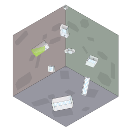
 I am entering Murky
Dealings into the One Page Dungeon Contest
2014, even though it turned out a lot different than I had original
intended it. As with my prior
entries, I’ve left specific details deliberately vague. When I
actually use a published dungeon (one page or otherwise), I
usually only make use of the skeleton anyway, and replace the rest with
campaign-specific stuff. I assume everyone else does the same thing, so
just try to provide a feel to a place and let the reader fill in the
blanks with stuff specific to their own game. (In the past, this
approach has irritated some judges, but so be it.)
I also think this is more in keeping with the system neutrality which supposedly governs the contest, making it easier to, for example, use the map in a sci-fi game. Settings which don’t allow flying will make this dungeon significantly more difficult (would work well as a final challenge for a modern tomb raiding type game, for example). Another variation is to play with just how dark is “dark”. If you ran it in the Ptolus setting’s Utterdark, for example, everyone would basically be totally blind between the rooms. Even if it is normal darkness, the “see in the dark” magic of most fantasy systems will (intentionally) only be able to see one or two rooms nearest to the one you are in, sometimes none.
I continue to use vector software for maps, though this one also made use of a 3d modelling system to get the shapes right. This dungeon is significantly shorter than what I’ve done in the past, and better suited to a single night’s play. Like my 2012 entry, this is also another attempt to build a dungeon that is not a directional graph.